Introduction to Data Journalism
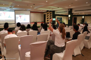
Data journalism was one of the three core themes in the 2022 Cambodia ICT Camp. That is why having Yan Naung Oak, Nida Soe, and Thet Paing from Thibi – data and design consultants in data-driven technologies – to introduce participants to data journalism was a great pleasure. Forty-three participants (16 women) attended the panel Introduction to Data Journalism.

Data journalism is using data to provide context and create a news story. It differs from journalism as it focuses on using infographics instead of words pitch headlines, convey content from (written) articles, and tell stories without the need to use words. Data journalism involves different processes, ranging from reviewing, analyzing, creating headings, statistical analysis, and data presentation. Simply put, data journalism provides timely updates to the readers on important issues. Instead of writing articles, the author uses charts to show new trends. Data journalism is extremely helpful when extraordinary events like the COVID-19 pandemic develop, or at the time of elections when data journalism contributes to providing timely updates on the electoral results to the population. In such regard, many organizations, including Open Development Cambodia (ODC), have done extraordinary work to help many users understand what data journalism is and involves.
Data journalism helps create stories tailored to people’s interests to which they can relate. For example, during the COVID-19 pandemic in the US, death in the U.S., the use of data and graphics easily allowed showing people where most infections were happening – that was done using data and maps with circles drawn in specific locations in their cities – so they could protect themselves from getting infected.

In addition, data journalism sets the story’s tone just by using visual aid. Data can convey different messages through different ways of visualizing data and can be used to deliver different messages to catch the reader’s attention if necessary. To give a clear example, Iraq’s bloody toll visualizations convey a strong message as the graphics look like a smear of red blood dropping down through its title, creating the bars showing the number of deaths.
Furthermore, data journalism allows professionals to communicate complex research results simply. For example, there was a lot of national and international news coverage about the 2019 and 2020 anti-government protests in Hong Kong. Identifying which news sources were reliable in the false information era was difficult.
Finally, the speakers provided several examples of the mining boom in Myanmar and land grabbing in Cambodia. They explored deforestation in Stung Treng province through data from Global Forest Watch.


